Monday 25 November 2013

Putting the subject first

So far in this course I have been developing the technical aspects of creating photographs in respect of composition, lighting and colour etc. I have so far, paid more attention to the graphic content rather than the subject matter. 

For the first part of the final chapter of The Art of Photography course, I am looking at putting the subject first. A large part of photography is directed towards the subject such as for example a news photograph. A news photograph is more about informing us about the subject rather than the technical aspects of the photograph. 

To demonstrate this point, I have looked through images I have collected from magazines, newspapers during the course and identified two photographs that contrast subject and treatment. In one, the subject should be of little importance, the technical aspects should be paramount. In the second, subject is all important. 


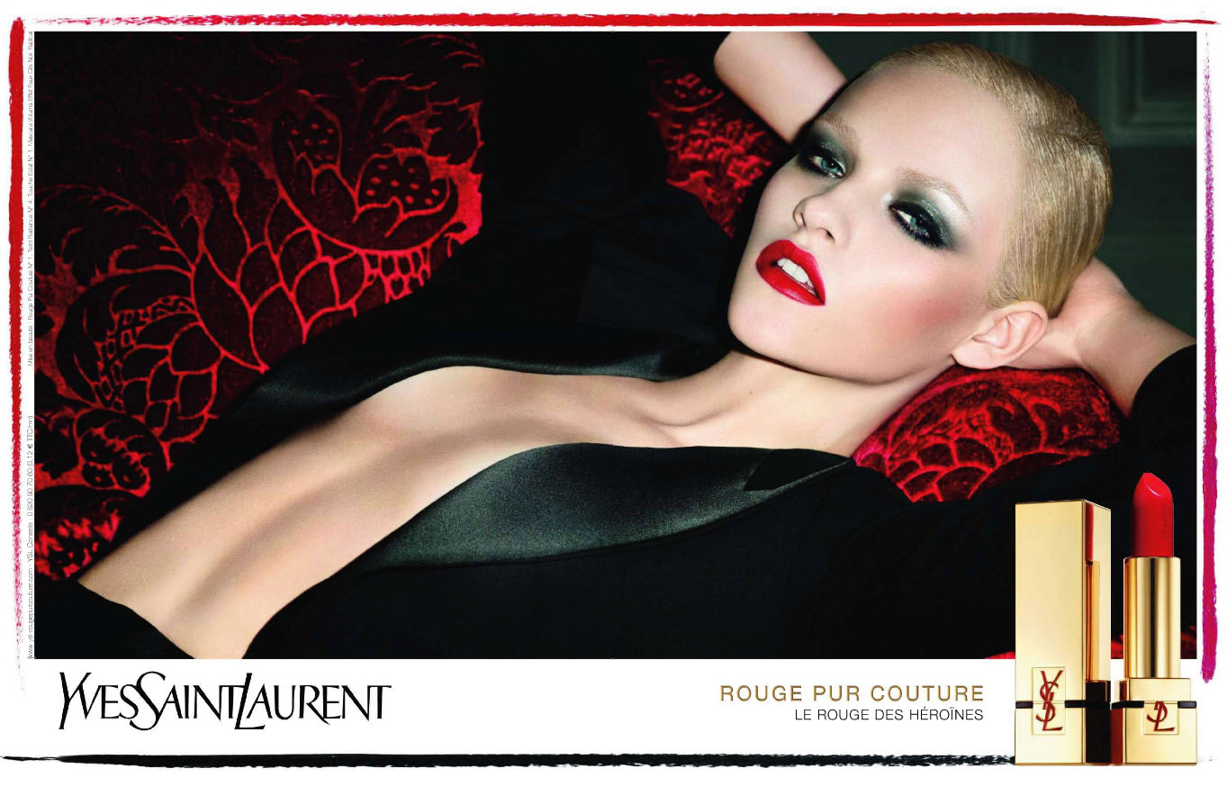
Photographer: Terry RIchardson 
Model: Ginta Lapina 

In this first photograph the subject is not the most important aspect. Even though it's a photograph of a very attractive women, the emphasis is on colour.  The red of the background, her red lips and the red lip stick all work together to highlight the product which is being advertised. The lighting produces a warm and subtle feel. 


Photo - NYDailyNews - REUTERS


The second photograph is a typical news photograph taken following the typhoon in the Philippines in early November 2013. 

The subject of this photograph is of paramount importance, showing events as they happen. The photograph is informing the viewer the terrible conditions suffered during and after the typhoon.

People carrying whatever they can salvage from their shatter homes.  The photograph is not technically very good, however it tells a very powerful story. 

The first photograph you could ay is 10% subject and 90% photographic treatment. In the second photograph the values are reversed. 

Assignment 4 - Tutors report

Overall Comments
Richard, I think this assignment has proved to be invaluable in increasing your skill set in studio lighting, with the choice of the old petrol can working well as the primary subject. I can see why you chose not to use your guitar, as it would have limited you in certain aspects of the assignment, although it is worth thinking about trying some shots in the future. Your presentation of the assignment is excellent especially with the accompanying light diagrams, as again this will prove invaluable as you build on this set of images.


Assessment Potential (after Assignments 1 and 4)
I understand your aim is to go for the Photography Degree and that you plan to submit your work for assessment at the end of this course. From the work you have shown in this assignment, and providing you commit yourself to the course, I suggest that you are very likely to be successful in the assessment.

Feedback On Assignment
Shape – The first shape example relies on the silhouette technique and your example here works well, although I wonder if a less obvious angle of view could have worked better. One where the viewer is not entirely sure what the object actually is, so that the images and sequence become one of not revealing too much information for the viewer, a gradual revealing of the object if you like. 

The second example allows more details to be revealed and the subtle lighting works very well. A different viewpoint could have also worked here, for example shooting the can from above, although this would have meant a slightly different lighting set up it could have been worth trying.

Form – You have illustrated form very well with these two images, the first one (maybe the crop is a little too tight?) works well and it is probably the best option in terms of showing the can in all of the sections, here we get the form, shape, colour and texture all in one shot.

The second shot is probably my favourite from the assignment as it shows the practicalities of the can perfectly; it draws the viewer in and makes them want to pick the can up! The three dimensional nature of the image (as you mention) goes a long way in making the above possible and is a great testament to your pre-visualisation skills, which have improved a lot as you have gone through this module.

Texture – There is a little bit of reflection on the left hand side of the can that spoils the first texture shot a little, the eye is drawn to the highlights straight away before ‘reading’ the image left to right. Again the crop seems a little too tight and allowing more room around the can could have worked better.

The second example works a lot better in terms of image quality and the angle of view, here you are also showing the viewer the working function of the can and by removing the cap you have given the can a kind of little animation. This is quite difficult to do within a studio setting but this shows that you have a good grasp of just what it takes to make an interesting image.

Colour – This seems to be the least strongest section of the assignment, there is little difference in the placing/framing of the can in both shots, although I think the second one where you used a gold reflector works the best as it plays on the actual colour very well. The first example is quite subtle although there is a little hotspot on the end of the can, which, because of the density of the image, does catch the eye.

I do think you are well suited to studio photography and from these initial results is definitely something that you should pursue in the future. Although maybe you need a heater of some kind for your garage!


Learning Log/Blog/Suggested Reading/Viewing/ Pointers For The Next Assignment

The final assignment in this section is a good chance to put together a fairly substantial piece of work that will need careful planning and research. The choice of subject is entirely up to yourself so if you have any ideas you wish to discuss please do get in touch.

Assignment 4 - Applying Lighting Techniques

For this assignment I have had to draw on my knowledge I have gained during the last section on light. I found this particular section the most enjoyable of the course so far. I brought some studio lights some time ago and only used them once or twice, not that I didn't want you use them, it was the lack of knowledge that was stopping me. So being able to use them for this part of the course was a bonus for me. 

For this assignment I was required to take at least 8 photographs of the same object using the lighting techniques learnt during this section demonstrating:

Shape 
Form
Texture
Colour

The subject for this assignment had initially been one of my electric guitars. After trying several test shots I found that this subject would be problematical. Being blue and very shiny this was going to be a challenge that is for sure. However in the end, it was the size of it that was going to cause me the most problems in the limited space I had for the studio set up. 

In the end I chose a rusting one gallon fuel can that I have had for sometime in the garage. The size for one thing would be a lot more manageable. As you will see during the course of the assignment the shape, colour and texture of the fuel can would make this a good choice of subject. 

My temporary studio was set up in my garage. Apart from being very cold this time of year, it would give me the space needed to complete the assignment. 


I used my Nikon D300 fitted with a 18-70mm nikkor lens. The lighting was to be provided by two Nikon speed light, a SB900 and a SB600. In addition I used the studio lights, these are a twin set of interfit lights, with soft box and umbrella. 

Shape 


The first set up was to demonstrate shape. This quality has to do with the outline of the object, its edges. Therefore the best way to show this is to clearly contrast it to a background, a silhouette for instance. 

I used the two interfit studio lights set to 1/8 power pointing directly at the white backdrop behind the fuel can which was situated on the black plinth ahead of the lights. The camera was set on a tripod pointing slightly downwards towards the subject and set to a shutter speed of 1/250 sec and an aperture of f5.6 ISO 200

The resulting silhouette outlines the fuel can. There is no colour visible and very little surface detail.


For the second photograph to demonstrate shape I chose to use the two speed light flash guns to outline the fuel can. The speed lights were set up on either side of the subject, 90 degrees to the camera. The object of this set up was to outline the fuel can from either side whilst keeping the side of the can in darkness. The camera again was set on the tripod and set to a shutter speed of 1/250 and an aperture of f10. The speed lights were set to 1/80 power, as I wanted to illuminate the sides of the can with soft lighting. 

I used two black GOBO’s either side of the camera lens to prevent lens flare, that had been present on a previous attempt of this set up. 


As you can see both of these photographs show that shape can be demonstrated with these different types of lighting as the outline of the can is clearly visible.

Form


Form is another way of describing the volume of a subject, how 3 dimensional it looks. Using shadows or differing tones within the photograph is the best way to show depth. Lighting produces highlights and shadows, so its effect on tonal variation is obvious. 


For this photograph I set the studio lights either side of the subject. To the left the soft box was fitted and to the right the umbrella. My objective was to show gentle changes in tonal values, therefore showing depth and form. 


For the second photograph I moved the lights 90 degrees to the subject and raised them so that they were both looking down at 45 degrees. This has created more tonal variation. Even though the fuel can is shown on a flat photograph it has the impression of being 3 dimensional due to the shadows and highlights present within the image. 

Texture


Texture is a quality of the surface detail. A small light at a very low angel to the subject produces the contrasting highlights and shadows needed to reveal texture.

The fuel can has raised lettering on both sides of it. In this photograph I set one of the studio lights on the left of subject and removed the light box, as small light sources produce sharply defined shadows. 

As you can see with the small light it produces shadows on the lettering giving it texture. 


As the fuel can is old and rusting, I used this photograph to highlight the texture of the ageing metal. 

Again using the naked light as the small light it would produce the necessary highlights and shadow required. Taken from a low angle the light produces shadows on the surface of the top of the can. The threaded neck of the opening can clearly be seen with this set up.

Initially I lit this scene with just the naked light to the front. This caused the area behind the filler cap to be in darkness. Therefore I placed a diffused light behind at 90 degrees to the naked light. The soft light produced by this light produced enough light to show the outline of the far side of the can but not too much as to interfere with the highlights and shadows produced by the naked light. 

Colour


This set up was used to best show the colour of the fuel can. 

I set up one of the studio lights 1/2 metre to the left of the subject at the same level, no other fill in lights were used. Setting the light in this was has highlighted one end of the can and produces a deep colour. The viewer is not distracted by any other feature on the fuel can. 


The final photograph was an identical set up to the previous photograph apart from a gold reflector positioned 8cm to the right of the can. 
This has produced an orange glow to the side of the can. As the can is old and rusty this has given the side of the can a further older aged look to the viewer. 


Conclusion 

As this series of photographs demonstrate an ordinary fuel can can be made to look very different, depending on the lighting arrangement. 


I feel that this section has brought me on as a photographer more than any other section. I think that this is down to the fact most of the proceeding sections I have had varying levels of previous knowledge, whereas lighting especially studio lighting is a new area for me. 

Monday 18 November 2013

Assignment 4 - Finally Submitted

Well that was a busy weekend, assignment 4 has completed and sent off to my tutor. The subject of the assignment was changed at the last minute, and I'm rather pleased I did. 

The resulting photographs were pretty good if I did say so myself and I hope my tutor agrees! I will be posting the assignment once it has been seen and appraised by my tutor....watch this space! 

Saturday 16 November 2013

Shiny surfaces

Exercise: Shiny surfaces ( 4-10 photographs)

So finally to the last exercise of this section on light. Shiny surfaces as you can imagine create special lighting problems when it comes to taking photographs. 

Light can reflect from a subject as diffuse reflection, direct reflection or glare. The amount of each type of reflection can vary with the subject. In this exercise we are looking at shiny surfaces, therefore we will be seeing mostly direct reflections. Direct reflection are a mirror image of the light source that produces them. 

The set up for this exercise was to photograph a subject that was shiny enough to see your face in; I chose a silver soup spoon. The camera was set up on a tripod looking directly down on the spoon. 


The first photograph was taken with naked light coming in from the windows to the right. The direct reflection can be seen on the spoon. For the diffused photograph, I used a cone made from tracing paper that extended from the lens to around the spoon in order to try and deal with the direct reflection. 

As you can see, not much has changed from the original photograph apart from the reducing the reflections from around the room and a slight diffusing of the light from the window. 


Using the same set up, I tried this again in my studio with an un-diffused studio light to the right. 

The first photograph taken with the naked light shows strong direct reflection. With the tracing paper cone in place the light has been diffused slightly and the shiny surface of the spoon has been slightly dulled. 

This set up with the camera looking directly down at the spoon and the light next to the camera is not the best set up. The camera is within the family of angles therefore can see the reflected light. Apart from moving the camera out of the family of angles there are several other methods you could use to effectively photograph a shiny surface such as a light tent.  

Friday 15 November 2013

Contrast and shadow fill

Exercise: Contrast and shadow fill (11 Photographs)

In the last exercise we looked at the lighting angle and how lighting the subject from different positions had a marked difference on the final photograph. As you saw in the last photograph of that series, when the sculpture was lit from above, the face was in total shadow. 

This exercise demonstrates how by using reflectors in addition to the studio lights you can control the amount of contrast within the photograph. Contrast is the difference between light and shade in a photograph. 

The set up for this exercise was similar to the previous one, photograph a still life composition. I used another sculpture for this, the curves would demonstrate contrast and shadow fill to best effect. 


1/160 sec @ f10 ISO 200
Fig 1 

As stated this set up was similar to before, the camera was mounted on a tripod and at the same level as the sculpture. The studio light which was placed 90 degrees to the left of the camera. 


The first photograph was taken with a naked light. The harsh shadow has been produced to the right of the sculpture. The combination of highlight and shadow in this instance does not show dimension. The hard shadow distracts from the primary subject. 


1/160 sec @ f10 ISO 200
Fig 2 

For the next photograph I fitted a diffuser to the light. As we have seen in the previous exercises this has the effect of softening the shadows. 


However in this case even the broader diffused light has done little to lighten the shadows on the right. 


1/160 sec @ f10 ISO 200
Fig 3 

Staying with the diffused light from the left, in this photograph I positioned a white reflector, 1 metre to the right of the sculpture. 


This resulted in a slight increase in the light to the right, but not enough to bring out any detail in the shadow area. 


1/160 sec @ f10 ISO 200
Fig 4 

Bringing the diffuser closer to the subject, in this case 0.5 metre, has resulted in a noticeable difference in the light present in the shadow area. 


Why is this? The reflected light is obviously brighter, but how much brighter?

The inverse square law states ' That intensity is inversely proportional to the square of the distance from the light source'

Taking that equation and applying it to our set up, the reflected light in this photograph is four times brighter than the previous photograph when the reflector was 1 metre away.  


1/160 sec @ f10 IOS 200
Fig 5

The next photograph was taken with the reflector to the right now covered with tin foil, the dull side facing the subject. 


With the foil reflector 0.5 metre away the amount of light reaching the subject is about the same as the previous photograph. 

The only difference I can see is that the reflected light is more or less the same as the studio light, whereas the reflected light of Fig 4 is whiter, as a white reflector was used.


1/160 sec @ f10 ISO 200
Fig 6

For this photograph the foil was turned around so that the shiny side was towards the subject. 

The shiny side of the foil is towards the subject causing the light to be more tightly focused and not diffused as per Fig 5 therefore the subject is brighter in some area of the shadows and darker in others.  


1/160 sec @ f10 ISO 200
Fig 7

For the final photograph of this exercise the tin foil was scrunched up and then flatten out again and used with the shiny side to the subject. 

The reflected light has been diffused as the light is now going off in many directions, resulting in a softer light. The subject is now being lit from many angles. 

Arranging the results in order of contrast from the one with the biggest difference between the lit and shaded parts to the least is as follows:


  • Fig 1 has the biggest difference between light and dark, naked light, no diffuser.
  • Fig 2 light with diffuser
  • Fig 3 reflector at 1 m
  • Fig 6 foil reflector shiny side to subject
  • Fig 7 crumpled foil reflector towards the subject
  • Fig 5 foil reflector dull side towards the subject
  • Fig 4 reflector 0.5 m away from subject has the least contrast

The results of this series of photographs worked out pretty much as I had expected and gave me an insight into direct reflections and the quality of light depending on the distance from the subject.

I repeated this exercise, this time using the studio light without diffuser. The results were exactly same as I had found previously. 

Thursday 14 November 2013

The Lighting Angle

Exercise: The lighting angle (11 photographs)

Following on from the previous exercise looking into the differences with diffused and naked light, this exercise requires a subject to lit from different angles using a diffused light. 

For all the following photographs the camera was fitted to a tripod and at the same height as the subject, and remained in this position throughout. The studio light was fitted with a lightbox, diffusing the light. This was then moved around the subject and the photographs taken. 

The subject I chose for this exercise was a stone garden sculpture. The curves and surface would be ideal in demonstrating the differences in the lighting angle.

1/160 sec @ f11 ISO 200 

The first photograph was taken with the studio light set to 2/8 power and directly alongside the camera to its left. 

Areas of shadow are present highlighting the  curves of the sculpture. 


1/160 sec @ f11 ISO 200

With the light 90 degrees to the cameras right more of the sculpture is in shadow.


1/160 sec @ f11 ISO 200

With the light now behind and to the cameras left, even less of the curves are highlighted. 


1/250 sec @ f29 ISO 200

The light now positioned directly behind the subject creates a silhouette with no detail present visible on the sculpture. The flash was turned down to 1/8 power for this photograph and the settings on the camera were altered to take into account the camera looking directly into the light. 


1/160 sec @ f11 ISO 200

The light was then raised up so it was looking down at 45 degrees. 

With the light to right of the camera and looking down. The curves and shape of the sculpture are shown with great effect. 


1/160 sec @ f11 ISO 200

Light moved to the left of the camera and looking down at 45 degrees.

The curves are not as well shown compared with the previous photograph. 


1/160 sec @ f11 ISO 200

Light directly overhead. 


1/160 sec @ f11 ISO 200

Light overhead to the rear.


1/160 sec @ f11 ISO 200

The final photograph, the light now overhead and to the front. 

Detail in the facial area has been lost, however the curves of the sculpture are shown in detail. 


In this series of photographs it can be clearly seen that the lighting angle can have a major effect on the resulting photograph. What angle would work for one subject, would be unsuitable for another. 

My favourite photograph of this series, is the final one. The overhead light angled towards the sculpture from the front highlights the curves to the best effect. The background is dark enough to make the sculpture stand out. A reflector may well have bounced sufficient light into the facial area to show the detail, but more of this technique in the next exercise! 

Softening the light

Exercise: Softening the light (2 photographs) 

For the first exercise for this part of the course, I was required to take two photographs of a still life arrangement; One using a diffused light and one with a naked light. Then to note down in this log what differences were found between the two photographs. 

I set my Nikon D300 on a tripod, it was fitted with a 18-70mm lens, the camera was set to an ISO of 200 and the shutter speed to 1/250 sec, the flash sync speed. The aperture would have to be varied with each shot depending on the lighting conditions. 

Photograph 1 - Naked light


Aperture f8


The first photograph was taken with the naked studio light to the left of the camera, at the same height as the subject. The camera was looking down on the subject from a 45 degree angle to the front. 

As you can see the naked light causes the edge of the shadow to be sharp and clearly defined. No light enters the shadow area, as is apparent on the dark side of the cactus.
This is an example of a high contrast light source. 


Photograph 2 - Diffused light

Aperture f10


For the second photograph, a light box was fitted to the studio light which, as you can see, gave a diffused light to the photograph. The light is now striking the subject from many angles. The shadow is no longer clearly defined. A shadow such as this one is called a soft shadow, and the light producing kit is called a soft light. This is an example of a low contrast light source. 

For single light sources the size of that light source is the primary factor influencing its contrast. 

Photographic lighting

The next section of this part of the course deals with artificial photographic lighting, i.e. flash and studio lighting. 

This is an area of photography I have dabble with in the past, with not much success. Sometime ago I purchased an Interfit EX150 two head studio light kit. This kit consisted of 2 light stands, 2 portable lights with 60cm soft box and umbrella. 


This set up was one that had been recommended to me by another photographer as an ideal starter kit. 

Each lighting head is 150w with a 60w halogen modelling light. The modelling lamp is used for previewing the lighting on the subject to give you some idea of what the lighting effect from the flash will be. 

This is certainly an area of photography that interests me and I am keen to further my knowledge. 


To supplement the course notes I am currently reading 'Light, science & Magic' an introduction to photographic lighting. ISBN 978-0-240-81225-0 

I have found this book to be an excellent addition to the study notes, the information contained is easy to follow, which is always a bonus for me!


It starts off with an explanation of the key principles of light. 

1. The effective size of the light source is the single most important decision in lighting a photograph.
2. Three types of reflections are possible from any surface, they determine why any surface looks the way it does. 
3. Some of these reflections occur only if a light strikes the surface from within a limited family of angles. After we decide what type of reflection is important, the family of angles determines where the light should or should not be. 

Variety with a low sun

Exercise: Variety with a low sun (Minimum 4 Photographs)

This exercise was to demonstrate some of the advantages of shooting when the sun is low in the sky.  I was to take a minimum of four photographs each with the sun in a different position in relation to the camera. The first with frontal lighting, i.e. the sun behind the camera, the second with the sun to the side, the third with back lighting, the sun behind the subject and finally with edge lighting. This is a special condition for shooting towards the sun, in which the sun is outside the viewfinder frame and the edge of the subject is lit. 

Ask any landscape photographer when is the best time of the day to take photographs? Their reply would most certainly be an hour or so after sunrise and an hour or so before sunset, the so called 'golden hour'. During these times the sun is low in the sky, therefore producing a soft diffused light which is much more photogenic than the harsh midday sun.


f16 @ 1/20 sec ISO 200

With the sun behind the camera, the trees are lit evenly with the low sun. The shadows from the beach parasols indicate how low the sun was. 

The sunlight travels thought more of the atmosphere at this time of day. The light appears more reddish as more of the blue light has been scattered.

The warm colour creates a pleasing scene. 


f6.3 @ 1/400 sec ISO 800

With the side to the left of the photograph, the sides of the building are thrown into shadow. The frontal area of the building is now highlighted with the low evening sun. 

The shadows from the balconies have created a pleasing scene of a relatively mundane tower block. 

If this same scene was photographed around midday the harsh light of the sun at that time of day would have created a bland photograph with no contrast.  


f16 @ 1/80 sec ISO 200

With the sun in front of the camera, I positioned the camera so that the branches of the tree obscured the sun in order to silhouette the outline of the tree and also to reduce lens flare to a minimum. 

Due to the fact the cameras sensor is looking directly into the sun, this can make for a tricky exposure. 

Therefore I took 3 photographs of this scene, one at 1/125 sec one at 1/100 sec and the one you see here at 1/80 sec. This method is called bracketing. This photograph taken at 1/80 sec, in my opinion is the best. It shows the dark silhouette of the tree but there is still enough light to illuminate the grass in the foreground.